Thursday, April 14, 2011

Community Arts Project.


“when children play, the world wins”

For our creative arts project, we decided to support the Right to PLAY charity that supported the notion that when children play, the world wins.
As a group, we thought this charity’s objective really hit home with early childhood’s philosophy of play, and children being active in their learning and in their childhood in general.

With that said, we wanted to promote more awareness of
“Sport incentive” amongst children, families, and the community.  Having sport incentive, we felt can educate children on leadership, foster role models and promote peace and give children hope for the future.

Picture yourself playing a game of your favourite sport.  What things come to mind? Some might say that we are engaged in competition, and fun or acts as a stress reliever. All those things are awesome components related to sports but also we forget about our differences in the world, such as our colour, religion, and cultural background- again we are merely there just to play the game and have fun!

This tolerance and understanding of gender parity among people, we learn to value that and ultimately makes us a better human beings.

Again, the concept of sport alone cannot ensure peace or solve complex social problems alone, but should instead, be positioned as a highly effective tool in a broader toolkit of development practices and should be applied in a holistic manner to achieve optimal results in children.


OUR BIG IDEA:
we want to support and facilitate children who are disadvantaged through the use of sport, physical activity and play to attain a specific development and peace objectives.

OBJECTIVE:
Flash Mob viral video, and stress ball

Storyboard on how we were going to shoot the Flash Mob Viral Video


REFLECTION:
I found that our group did really well in that we were effective in communicating our stance and our big idea.
I thought everyone contributed key points in their parts that they presented, allowing each member to feed off each others points to allow our big idea to go further, and allow discussion amongst us and our peers in our group. The only thing that I think we could have done differently would be to maybe to actually design the stress balls that were apart of our “take-away: for the class. 
Other than that, I felt we followed through with what we planned to do with our big idea!

As an Early Childhood Educator...i think its great to give children exposure to to diversity and social justice, but obviously introduced to them in a child-friendly way. During circle time, create a visual bristol board on a community issue such as one mentioned above.  Get children to understand the issue, have children discuss what they have learned, and then formulate an activity that contributes and demonstrates their understanding of the foundations cause. Also bring in guest speakers to talk about their cause with the children!


Art Word of the Week: Design or Composition
Is the overall mark of success and the standard of achievement.  Design or Composition may attempt to address whether the artist had accomplished what he or she intended to do. (Schirrmacher & Fox, 2009).

In this project, Design was used to describe our position through the use of art, in this case a storyboard of our viral video.  The design to demonstrate our concept was our overall composition.  I feel what we intended to do with the storyboard, definitely turned out like we wanted it to look!
References
Schirrmacher, R., & Fox, J. E. (2009). Art & Creative Development for Young Children (6 ed.). Belmont, CA: Delmar.

Wednesday, April 13, 2011

Coke Cans.

A toy Camera made out of coke cans!
--> Was a gift from my gramps when he went to Morocco for a month
--> He had purchased this toy camera off a vender that was making all sorts of products with the simple use of pop cans.


Guerilla ART


[Live] LIFE!

What is guerilla art?
Guerilla art is the surreptitious and often sudden, creation or installation of unauthorized public art, often with the purpose of making an overt political statement.  The term is often used interchangeably with “street art.”  It is a fun and insidious way of sharing your vision with the world. 
Guerilla art consists of reclaiming space and changing its dynamics with images or counter images, art that has been created anonymously and left on walls or in places such as public squares. 
It can be done for a variety of reasons, to make a statement, to share your ideas, or just for fun!
In my attempt for expressing gueirlla art in my community I wanted to make a statement and send a spontaneous message through the simple use of chalk and your very own street as your template!

OBJECTIVE: To send a meaningful and spontaneous message with the simple use of chalk

MISSION: try to evacuate and/or close down my entire street to perform the greatest shocking art ever…

IF that fails… which it did…

Plan B: Be Simple. Head out to the streets at night where not many people are out.


THE PROCESS:

What our message looked like on my very own street!

The sidewalks are also chalked with the message as well.

 
I had a lot of fun doing this blog, I loved it because it was spontaneous, it was related to art and school and most importantly I could hang with my friends while doing school work.  To me, it didn’t feel like schoolwork, just felt like a regular day just being silly with your friends.

For my guerilla art, our message was “ Live life”.  I think people are so focused with what they gotta get done that day when they forget to realize and look at the beauty of life.  Again people these days don’t stop to look at the beauty of life, and to live and cherish each day like it’s a new day, rather than looking at it as a chore or a task to complete.  So I thought in order to get my spontaneous message across I wanted people to see this message during rush hour, where everyone is rushing to work.

I decided to place my guerilla art in the middle of the street and on parts of the side walk because my street is always so busy and packed in the morning since my street is literally right next the subway.  Overtime, my street has been considered a giant waiting zone.  It’s a little annoying to come home to a bunch of cars waiting outside your home, but for this project… it really benefited me. More crowd the better!

So we went out at night, and drew our message along my street and on the sidewalks!

THE AFTERMATH:
I probably should have checked the forecast of the day after we had completed the art, because the next day it was raining. Ofcourse, my artwork had semi washed away, it was surprisingly still visible.  I manage to have woken up, when it had stopped raining and the sun had come out. It was about 7am, so there wasn't as many people out as i had expected, but i did catch one gentleman on his way to work and that was making a u-turn on my street, but had stopped infront of the message to read it
1st reaction: Gentleman walking and notices chalk along sidewalk
He then turns around to view the big message written on the road.

2nd reaction: Car making a U-turn on my street, and decides to stop in front of the message to look at it.

There was also a 3rd reaction, which was from a mother and a child. The child loved the spontaneous message, and was so intrigued by the side walk chalk that the child was playing with it (jumping on the giant message).  Unfortuanlty, i wasn't fast enough to capture this moment, but it was really great to see the reaction of the child, and how happy the child was!

As an Early Childhood Educator...
Create an art activity that focuses on freedom of expression.  Allow children to express what their feeling through art, using whatever they can get their hands on. After their products are complete have them go around the neighborhood and/or playground and post their artwork where ever they feel.  Its fun, spontaneous and gives children the opportunity to explore and have fun with their creations!

Art Word of the Week: Line
A mark made on something that is visible to the eye. It can be illustrated through crayons, paint, pencil or chalk (which I used in my spontaneous message).  It can have their own dimensions such as size, direction, length, width, and weight (Schirrmacher & Fox, 2009).

The art word of the week can be seen in the way i formulated the letters into block letters, to make it more three-dimensional. 


References
Schirrmacher, R., & Fox, J. E. (2009). Art & Creative Development for Young Children (6 ed.). Belmont, CA: Delmar.

Thursday, April 7, 2011

Pretend Play and Magical Thinking


Name: Princess Starra Bucks
Date of birth: August 10, 1991
Age: 20
Place of birth: Seattle
Currently living: Manhattan, New York City
Occupation: A student studying photography at Columbia University.
Language (s): English, Italian, French, Chinese, German, Arabic
Likes: being with friends and family/ alternative, jazz and a huge fan of Josh Groban/ reading/ sandwich wraps such as her all time favourite
è egg white, spinach & feta wrap/ teas/frappachinos/ the outdoors/nature/ Breakfast
Dislikes: Vandalism/Vulgarness Pollution/ Global Warming/ being alone/ unfriendly people
Hobbies: re-arranging furniture in her room, designing art work, riding bikes, photography
Arch Nemesis:  Tim Horton’s


      Once Upon a time in a kingdom far, far away aka Manhattan New York, there lived a beautiful princess named Starra Bucks.  She was a unique princess as her long luscious hair was naturally ivy green.  Her best friend was her pet pigeon named…“Pigeon” who had always travelled with her wherever she went.  It was like having company and a best friend with you 24/7.  She is the only child, and was spoiled rotten ever since she was little.  Her Father, aka the King Of Manhattan, Starsky Hutch Bucks, was the most powerful man in America owning an abundance of coffee shops and partaking in community organizations all over the world- his current work: STARBUCKS RED.  Yes, he was a big deal… bigger than President Barak Obama. 
      The Queen on the other hand, named, Queen Latifah Bucks, was also a powerful women, participating in community organizations alongside the King.  But what the Queen was most known for was her talent as an r&b recording artist.
Ofcourse her parent’s had already paved the way for success for Princess Starra, she was inspired and took photography at Columbia University. 
You could say she had led the perfect glam life, but behind all that- it was the life that Princess Starra did not like living.  The Princess was unhappy.  But your probably wondering, why is Princess Starra so sad when she has got everything just at the tips of her fingers!?!? Well kids… I will answer for you.  Yes she did have everything, everything that didn’t include… love.
      You see Princess Starra did fall in love when she had travelled to Canada for school for a year.  But it wasn’t your typical fairytale ending love… it was forbidden n love. (DUN DUN DUN- Haha sorry I had to)  That’s right kids! She had fallen inlove with Prince Tim Jr. Horton’s, her family’s Arch Nemesis.
    King Tim Horton’s had own all coffee shops in Canada, and were known to have the best and yet addicting coffee in the entire world.  Tim Horton’s business was ever growing and was slowly expanding into American territory, which King Starsky Hutch Bucks did not like.  Ofcourse, these conflicting families have been at competition with each other for centuries, and it was not the smartest move for Princess Starra to fall in love with someone that was disliked.
Princess Starra was in a dilemma. What do you think her next move should be…
1) Ignore her affection for Prince Tim Jr. Horton
2) Pursue her affection for Prince Tim. Jr. Horton openly- her parent’s can’t be mad at her forever
OR…
3) Keep the relationship a secret…

To be continued…

As an Early Childhood Educator... it is important to be creative when you are given any situation and/or inanimate object.  Try to make the best of what you have, and create a story based on suggestions and opinions from the children.  Make sure children are involved in the process of creating the story, as it makes the story more intriguing to them, because they feel they are apart of the story being told.  Add a little spunk to the story while your telling it by adding background music that correlates with the dialogue!


Art Word of the Week: Shape 
Shape "refers to the outside form of a two-dimensional object that has length and width" (Schirrmacher & Fox, 2009, p. 140).  Shape also has its "own qualities and personalities to it as well"(p. 140). 
For this blog, i looked at the shape of the illustration on the cup.  It really inspired me to formulate the objects personally by looking at the circular illustration.
References
Schirrmacher, R., & Fox, J. E. (2009). Art & Creative Development for Young Children (6 ed.). Belmont, CA: Delmar.

Monday, April 4, 2011

Collaging With Scissors.

How can we represent our identities and understandings of the world we live in?
In learning your own identity and your place in the world, I thought it be best to express that through "collaging with scissors."  Making a collage of your favourite television show, your favourite foods, clothing brands, or even just making a memory collage of all those awesome times you had with your friends.  For this very purpose of representing my identity I wanted to share that through a friendship collage that I had created with my friends.


Friendship Collage

Friendship Collage 101
My friends and I decided to make a collage art activity that required cutting out pictures from photo albums and cutting out pictures or words- from magazines, books, newspapers- that had correlated with our past and present memories of each other.  We even found necklaces and other little trinkets that were reminders of the great times, and sometimes the embarrassing times.  The best part of making the collage was the process of reminiscing vivid memories and the good old days back when we were all in elementary school to high school to university!  Our collage was a statement complimenting and expressing our friendship in terms of its sentimental value and meaning.
Making a friendship collage
You will need:
Scissors
Photographs.
Glue
Poster board
Steps:
1. Choose the photographs you want to use for the collage.
2. Cut the poster board to the size you want it to be for the base.
3. Cut your photographs into different shapes .You may want to crop it so there is no background.
4. Cut out letters or words from magazines, fitting them together to make phrases to describe the picture.
5. Apply glue to the back of the picture and phrases and firmly press them down on the base. Continue to do this with each item. Try overlapping some pieces. You can glue small objects [like foam craft items you can buy] over or between the pictures.
6. When you are finished, let the collage dry

As an Early Childhood Educator...
Prepare an activity expressing the concept of friendship.  Educate children on this notion by allowing children to draw what they view friendship as.  Once everyone has drawn a friendship picture, each will cut, and paste the pictures onto a giant board.  Do not worry of how neat the pictures are pasted, that's the whole essence of a collage- just pasting different shapes and sizes, overlapping picture after picture.  Play some background music to set the mood, and most importantly have fun with it!

Art Word of the Week: Space

Space is the total area defined by the size of the artist's paper or canvas.  Within the overall space, you have to determine how you are going to arrange elements to compliment or fill that space. (Schirrmacher & Fox, 2009, p. 368). 

For my collage, it demonstrates positive space as the collage is completely filled with vibrant colours and designs of pictures.  This is very much random placing of the elements.

References
Schirrmacher, R., & Fox, J. E. (2009). Art & Creative Development for Young Children (6 ed.). Belmont, CA: Delmar.

Thursday, March 31, 2011

Grocery Shopping With A Twist.


      When I’m grocery shopping at my metro, I tend to gravitate towards the bread section of the supermarket.  I walk in, I quickly pass the fruits and vegetables and I spend most of my time checking out and trying new forms of bread!  I love bread, as I literally cannot get enough of it.  It’s in every meal I eat, whether it’s the main course or there to compliment the main course.  Breakfast is a time for me to whip up some solid meals using bread, such as eggs, ham and cheese bagel, French toast, or even the simplest of just toasting a bagel and putting peanut butter and jam.  Working with bread is never hard, and can be the simplest component in adding to or enhancing a meal. 

       Bread has been around for ages.  While trends such as low carbohydrate nutrition or low fat dieting come and go, bread is here to stay- people!  Bread is also healthy as it increases your protein intake, add fiber to your diet, and refill your muscles by supplying quality carbohydrate in addition to healthy fats, vitamins, and minerals!


My Favourite Types Of Bread
White bread:
- the most variety of bread. 
- looks white
- soft texture

Wholewheat bread:

- made from whole wheat flour
- contains all the components of the grain
- it has become the most popular with increasing knowledge of the health benefits of bran and what germ
- looks brown
- soft texture

Mixed Grain bread:
-
may be made from any combination of grains (e.g. kibbled grains, wheat germ, whole grains or wheat and other cereals) and seeds (e.g. sesame seeds)
- looks brown
- rough texture

Lavash bread:
- made from white wheat flour, yeast, salt and water which is oven-baked on a heated metal plate
- thin
- flat bread

Bagal:
- is shaped into a ring  
- has a crusty a chewy texture. 
- it may be coated with poppy or sesame seeds and can be flavored (e.g raisin and cinnamon)

Pita Bread:
- The pocket can also be stuffed with various fillings
- drier on the outside
- softer on the inside
- flat
- oval 
- rough on the outside, and soft on the inside

Naan:

- made in india, Pakistan and Afghanistan. 
- flattish
- crisp texture

Chinese Steam Bread:

- eaten in most countries of east Asia
- shaped like a ball and may have a sweet bean paste or meat filling
- “Lao bing is a Chinese-style flat bread

Glutan-free bread:

- has a dense and more crumbly texture than traditional bread


My Sketches of Bread
As an Early Childhood Educator...i would create a chart of all foods that children know when they go shopping at their local grocery market.  These foods can include- favourite breads, cheese, fruit and vegetables or even candy.At the beginning of circle time, pull this chart out and ask children to identify what's their favourite type of food.  Then ask the children about the shape, texture and colour of the type of food chosen. I think this is great way to get children's mind's thinking and allows them to experience and view their favourite food in a more analytical way!


Art Word of the Week: Texture

Texture refers to how the quality of any surface of an object when you touch it.
(Schirrmacher & Fox, 2009). 

Bread has so many different textures.  it can be rough, bumpy, smooth or soft.  What i also think is so great about bread is, is that their exterior may feel rough, but the interior is a soft feeling and vice versa!  For example: a croissant. Its rough on the outside, but soft on the inside.

References
Schirrmacher, R., & Fox, J. E. (2009). Art & Creative Development for Young Children (6 ed.). Belmont, CA: Delmar.

Monday, March 28, 2011

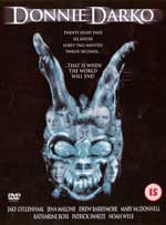
Art Flim Review

      My first reaction to the film, in just be looking at the title and cover of the flim, I thought it was going to be another movie with a creepy teenage boy that had a lot of problems, yes, another movie that was the same as every other movie only worse.  I was not keen in watching the film, but hey when Jake Gyllenhaal stars in it, really sparks my interest in being committed in watching the film.  But in the end, my judgments about the film were wrong.  It was surprisingly one of my favourite art movies I’ve experienced in awhile.
     At times, the film was a bit confusing since it would frequently switch between reality and fantasy to the point where it just becomes difficult to comprehend and read, but it was defiantly an experience and was an incredible work of art. 
     I loved how the film asked questions about reality, fantasy, and life in general for a typical teen to think about.  The protagonist in the film, Donnie Darko (played by Jake Gyllenhaal) is filled with all these questions about the ordinary and/or the extraordinary.  His character is interesting is a tortured soul whose life is ordinary. All he wants is sanity, but his mind is infested with unbelievable hallucinations, compulsions driven by a mysterious creature named “Frank”.  Gyllenhaal as Darko in the film is simply brilliant and creepy at the same time, as his character consistently transitions from being normal to the abnormal teen that he is.  As the viewer of the film, Darko’s potential unstable and dangerous man child character as he is tortured throughout the journey of the film, defiantly drived the film.  I felt that Richard Kelly wanted the viewers to subconsciously connect with Donnie Darko’s character in a way no one else could have, through each individual interpretation of the character’s behaviour and action.  I thought Richard Kelly and Jake Gyllenhaal really worked well together to create this masterpiece of art.  It really kept me on my toes continually, with beautiful and at times deceivingly haunting cinematography, making the dull and ordinary life of a teen menacing and truly insane.
     Tension is constant in this film, and Kelly doesn’t stop building it for a moment, right up until the last second when the film reaches its explosion of a resolution.  I felt that after I watched the film, it really screwed with my mind, and sucked all my emotions out of me.  I felt literally numb, no feeling just a blank slate starring at the end credits thinking “ wow, what did I just watch.”  And it made me question myself in terms of where does reality really begin and end? Overall, the film gave me chills, and made me think in ways that I would never have thought of.
As an Early Childhood Educator...

Give children a treat and a different approach of teaching children art appreciation and art aesthetics.  Expose children to art films every other friday.  After watching the short film, allow children to discuss what they thought of the film. 


Art Word of the Week: Design or Composition

Design & Composition is the "overall mark of success, the standard of achievement, and the frosting on the cake" (Schirrmacher & Fox, 2009, p. 142). 

Design should relate to the standard of achievement making it all relative. Throughout this film, i thought the producer definitely knew what he wanted to achieve, and he did a brilliant job in creating such an artistic, dynamic and mind thrilling movie to achieve that design and level of standard from his audience.  

References
Schirrmacher, R., & Fox, J. E. (2009). Art & Creative Development for Young Children (6 ed.). Belmont, CA: Delmar.

Tuesday, March 15, 2011

Everyday Patterns


Patterns of the houses- San Fransisco
This by far, was my favourite Art's Explorer activity.  Patterns are found everywhere, whether its from looking at architectural buildings, floor tile in your kitchen, or even a broken fence just off the side of a highway.  Patterns allows an one to use their own imagination to make something so simple into something that's extravagant!

What is a pattern?
A pattern is an artistic decorative design.  It is a consistent, characteristic form, style, method.  It is the repetition of an element(s) in a work.  Anyone can achieve a pattern through utilizing artistic methods and tools available such as colours. lines, shapes, shades etc.

A big part of where I find everyday patterns in urban settings is whenever I travel! I wouldn't call myself a "pro-photographer" but I absolutely have an obsession with taking random photos that I find gorgeous. These photos were both taken when i had travelled to San Fransisco and New York City, and i noticed that the majority of my photographs had a consistent theme: Patterns.
Zig-Zag Stairs- New York
As an Early Childhood Educator...
Educate children on what a pattern is during circle time.  Bring objects from home, or even when your running errands- shapes, and patterns are everywhere!
Set this patterns and shapes as an activity for children to do in the classroom.  An outdoor activity for children becoming familiar with patterns is taking them outdoors! Play "pattern scavenger hunt" and allow children to pick out patterns within their own playground!

Art Word of the Week: Pattern

A pattern is a "mark or design that is repeated in some recurring sequence" (Schirrmacher & Fox, 2009).

Through the pictures i had took through my vacational journeys, majority of the pictures have a design that has distinctly been repeated to create the greater asthetic appeal to a building or a piece of clothing.


References
Schirrmacher, R., & Fox, J. E. (2009). Art & Creative Development for Young Children (6 ed.). Belmont, CA: Delmar.

Tuesday, February 1, 2011

The Massacre of the Innocents.

"the principal goal of education is to create men who are capable of doing new things, not simply repeating what other generations have created- men who are creative, inventive, discoverers" - Jean Piaget

Art word of the week: Design & Composition
The elements of an artwork including texture, colour, and balance that harmoniously contribute to the idea of what the artist is portraying is defined as the design or composition of an artwork. If all these artistic aspects work well within the painting, it can be seen as having an overall solid design or composition 
(Schirrmacher & Fox, 2009).

The Massacre of the Innocents by Peter Paul Rubens
Peter Paul Rubens had painted this in the seventeenth century and was part of the Liechtenstein Collection in Vienna, Austria.  This graphic yet creative painting seems to be widely known as the artist’s perceptions and learning’s from his time spent in Italy between 1600 and 1608.   If you delve the painting deeper, you can see the drama and emotive dynamism of the scene, as well as the rich and realistic colour, lines and shapes that were added to create depth to the painting.
My first initial reaction of this photo was disturbance, confusion, brutality, turmoil and hostility.  What really intrigued me most about the painting was the disturbing concept and idea in which the painting was revolved around: the slaughter of the innocents (women and children) who are essentially classified as the weaker and most vulnerable.  What’s also fascinating about this painting is the significant use of immaculate detail.  This profound set of intricate details gives the painting a realistic viewpoint, and it makes it seem like you are right there in the action, understanding and comprehending the essence of what is currently going on.
In terms of symbolism, it seems that the artwork portrays the struggle for “power” between the conflicting genders of man and women.  This is shown in the painting as the males are fighting against the females.  Also, the painting demonstrates elevation, as the men are on top of the women symbolizing their strength, dominance and masculinity within society.  In continuing this point, what’s really interesting is that although the men are portrayed in the painting as showing their dominance, it seems that the women are not afraid to go against this “dominance”.  In fact in seems that the women are trying to overthrow their power in society as strong men.  On another note, if you look at the painting from the left of the painting it is light and when you move towards the right it becomes darker.  (Light- innocent and purity to Dark- cruelty, evilness).  This could be taken as a metaphor that society may be transitioning from a period of cooperation, peacefulness and beauty to the reality and cruelty of life, destructed by authoritative figures –men.

As an Early Childhood Educator...
 
Bring children to an art museum for a field trip! Get children to experience art not only within the classroom, but outside the classroom. This sparks interests, and curiosity and widen's children's knowledge on art and its history! After the trip to the museum, create an activity that focuses on some of the key artists that the children had saw paintings of.

References
Schirrmacher, R., & Fox, J. E. (2009). Art & Creative Development for Young Children (6 ed.). Belmont, CA: Delmar.

Thursday, January 27, 2011

Sculpt IT!

Art Word of the week: Balance

Balance is a result of how space is used. It is a basic principle of art that refers to the ways in which the specific elements of lines, shapes, colors and textures are arranged and organized. These pieces can be arranged in a symmetrical (formal) form, where each art element are given equal “weight” from an imaginary line in the middle of a piece. All together, the piece work together to produce a sense of harmony and synchronization(Schirrmacher & Fox, 2009).
Balance can also take an Asymmetrical (informal) form, where balance occurs when elements are placed unevenly in a piece, but again ultimately work together to produce a sense of synchronization. Even though it may not have perfect symmetry, your design can still look awesome.


Picture Frame-Easel


However, for my sculpture, the form of balance that is present here is Symmetrical. As you take a look at the photographs, the sculpture is a perfectly centered composition, in other words, a ‘mirror image.’ I had this in mind when I was designing my sculpture because it had to be balanced in order for my sculpture to be stabilized. I made sure that each piece was evenly divided so that it aligned with the center so that it was efficiently able to balance on its own based on the shape and weight of the product.
materials used to construct the "Picture Frame-Easel":
- pieces of straw
- thick wire
- cardboard
- string

References
Schirrmacher, R., & Fox, J. E. (2009). Art & Creative Development for Young Children (6 ed.). Belmont, CA: Delmar.

As an early childhood educator...Children love creating things with things that out of the ordinary.  Won't matter if its scraps or junk, children will always make the best of what they have and at the same time will expand their creativity from creating something using scraps.  Create an art activity that involves having scraps of random paper lying around the classroom, a broken pencil or straw... anything in the classroom! See what the children can create by using materials that are already within your own classroom!

Tuesday, January 18, 2011

the innovative mind.

“Sometimes you've got to let everything go - purge yourself. If you are unhappy with anything . . . whatever is bringing you down, get rid of it. Because you'll find that when you're free, your true creativity, your true self comes out"- Tina Turner


Creativity:
- imaginative
- confidence
- free
- diverse
- inventive
- process
- product
- growth


     Yes… Yes I know… You’re all probably thinking yield sign, has no correlation with the term “creativity” whatsoever- that indeed is correct, but if you look outside the box, you can see there is a familiar shape that jumps off the page, a triangle.  I chose this picture because it allows people to think-- that is considered the first key aspect needed for creativity to begin and to start flourishing.
      As may of you know, the triangle is a symbolism for creativity.  The shape is known for its versatility in terms of how people apply various meanings to it.   Some examples of different meanings applied to this shape include the obvious of up or down but also the deeper connections of having choices (such as the 3 points of the triangle represent different passages that can be ventured.)  Having different meanings allocates how flexible innovative expression can be, and that it can never be concrete.

My Creative Expression:
      I relate my creativity to the shape of a triangle.  It is never rigid, and is always open to learning and gaining knowledge on new discoveries and alternatives that is key in continuously growing an individual's innovation.  In terms of my experiences with creative expression, I've sort of accepted it as part of my everyday language, and everyday survival tool.  Here are some ways i've expressed my innovation presently and in the past.

innovative expressions:

Being creative can also how an individual portrays themselves.  For me, mixing fashion styles from military to 80s, or urban to grunge is addicting, and fun. Sometimes the styles work, other times.... questionable.  But that's just it, taking risks is what needs to happen in order for your creativity to flourish!  Sureee you might have looked like an idiot at the time, but hey, you took a risk, made mistakes along the way, harnessed some awesome ideas, and grew from it!
Year: 2007- present
 I call this my "junk board." The board changes depending on my mood, and whether i have time to re-vamp.  I usually pick a theme whether its fashion, a favorite coluor, a season or movie stars.  I sometimes have random crafts and junk in my room, or find inspiring photographs in magazines.  Basically, anything and everything can go on a "junk board," because its not just about aesthetic appeal, but about the meaning behind each photograph or craft.


Year: 2009-2010
Top photo: This is a "Media Kit."  In my media arts class, we had to create a brand and company name.  Our objective was to promote this "made-up" brand, by creating a unique media kit and pitching it to the class at the end of the process.  My brand was called "DeepGreen" and catered to woman's fashion.  Everything in the kit was created by on photoshop and adobe this includes photographs, brand logo, title page and layout. 
Bottom photo: This is an example of my first advertisement that i created


Year: 2007
This is a sketch of a multiple picutres of sponge bob. Personally, I dont find myself great at drawing, but i decided to challenge myself. Every year in highschool, different mural wall paintings were put on all of the walls of the school.  I voluntarily, and with alittle push from my friends entered for fun.  Unfortunately, my mural wasn't up to par with the other amazing art murals, but hey, i quite liked my design, and that's what matters!
Year: 2001-2005
Website designing on freewebs.com. Was a personal website for myself, and was a way for me to express my passion for fashion with others all around the world.  On the site i had fashion photographs, layouts, icons and tips revolving around fashion fads and styling.